Reworking sign-up & onboarding to improve user engagement

An updated freelancer dashboard and onboarding journey for MyPocketSkill

Role

UX Design

Timeline

4 months

Platform

Web

Areas

UI, Research
Background

MyPocketSkill is a startup in London which enables young freelancers to engage in short-term work opportunities such as tutoring and social media work.

In this project, I redesigned the dashboard for the freelancer-side users. I was the primary product designer for this project. I collaborated with developers and the founders throughout the project to elicit their feedback, requirements and viewpoints.

Problem

Analytics and user interviews demonstrated sign-up drop-offs and lacklustre onboarding completion

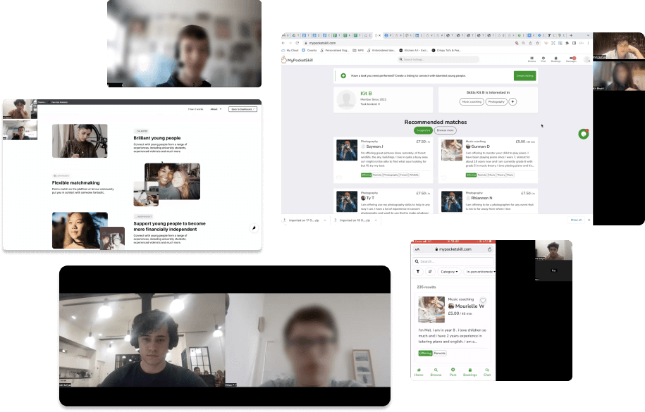
An analysis of our sign up data which demonstrated there was potential for improving the engagement of young freelancers that used the platform. The data showed significant drop-offs at several points during the onboarding journey. Many initially signed up freelancers failed to sign up to an onboarding call or complete key onboarding tasks that we associated with long-term usage. This was further informed by user interviews I had previously conducted.

Screenshots from user interviews

Identified Problems

I collated findings from user interviews and analytics and discussed this with the team. The presentation included data, prioritised issues and ideas for improvement. After some discussion, we decided this would be a key focus for us in the coming months. Some of the primary issues we were aiming to solve are illustrated below.

Problem #1

Users didn't complete key onboarding tasks

Users often finished sign-up and didn't complete the key tasks we associated with long-term usage (such as completing an onboarding call, applying for tasks, etc.). The existing dashboard didn't give them any signal on what to do next.
Problem #2

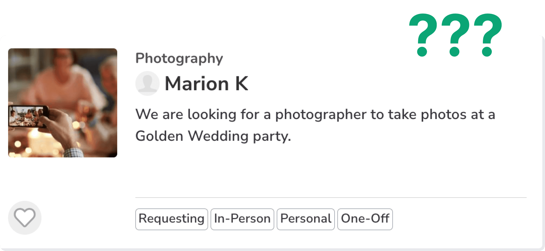
Existing tasks which appeared on the dashboard weren't always relevant

When users first signed up, we asked them what task types they were interested in completing. However, this broke down long term as long-term users often had behaviour that differed from what they initially said during sign-up.
Problem #3

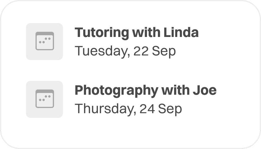
Users wanted an easy way to track their upcoming bookings

We had an issue where users found it difficult to track their existing bookings. This often resulted in people not showing up on time or at all.

Redesign Goal

How might we increase long-term retention and activation of our supply-side users?
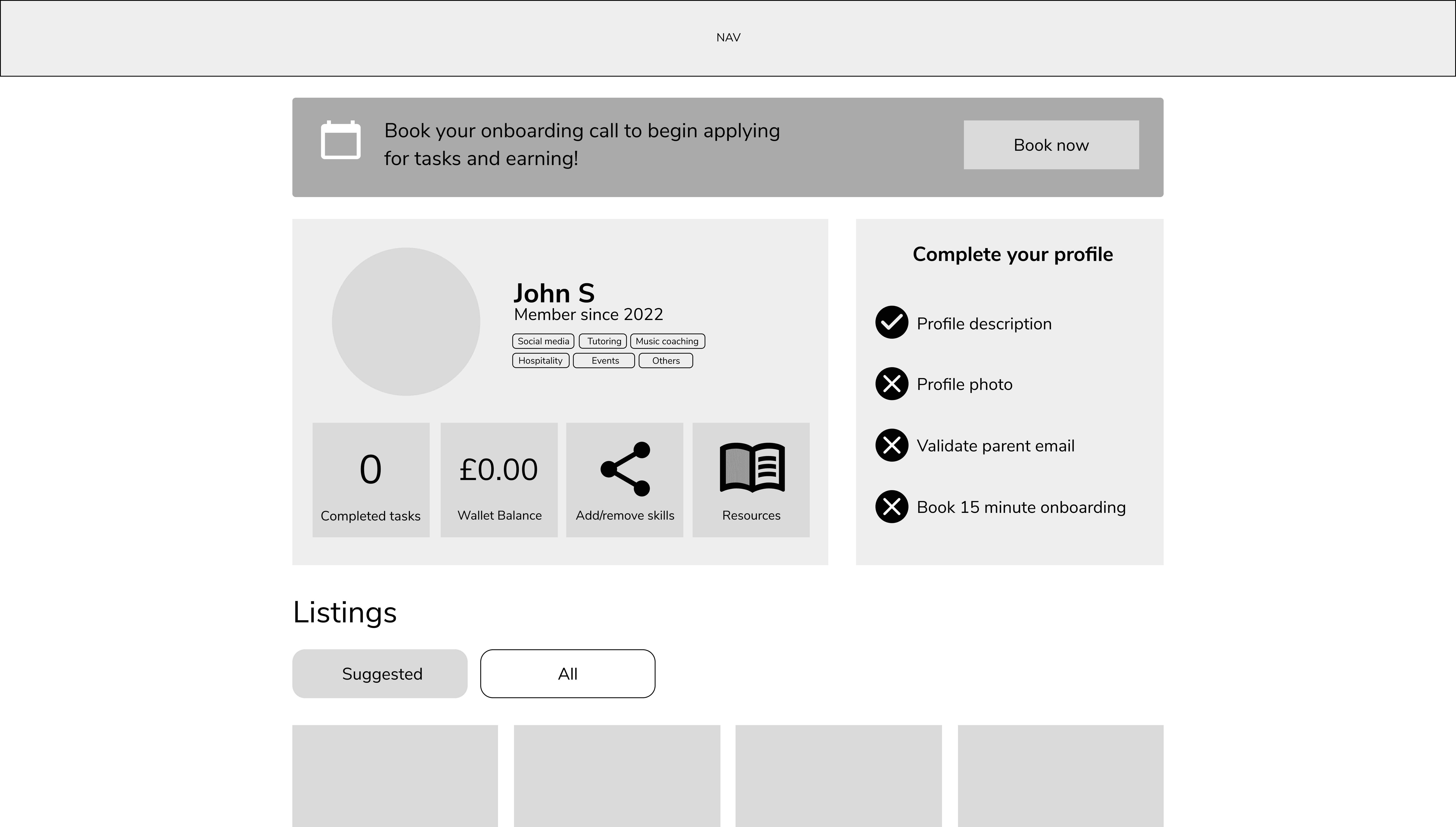
Exploring different versions

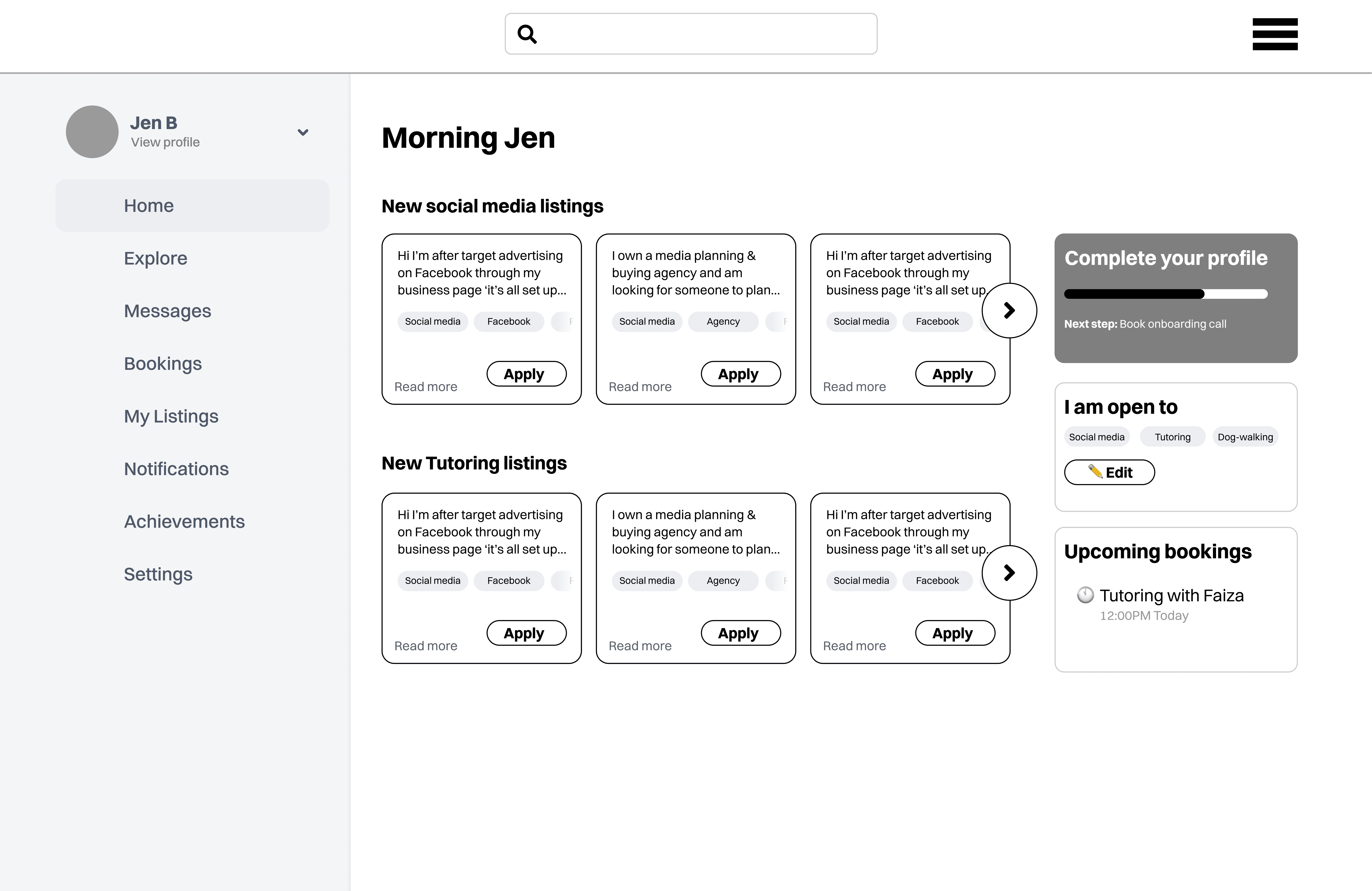
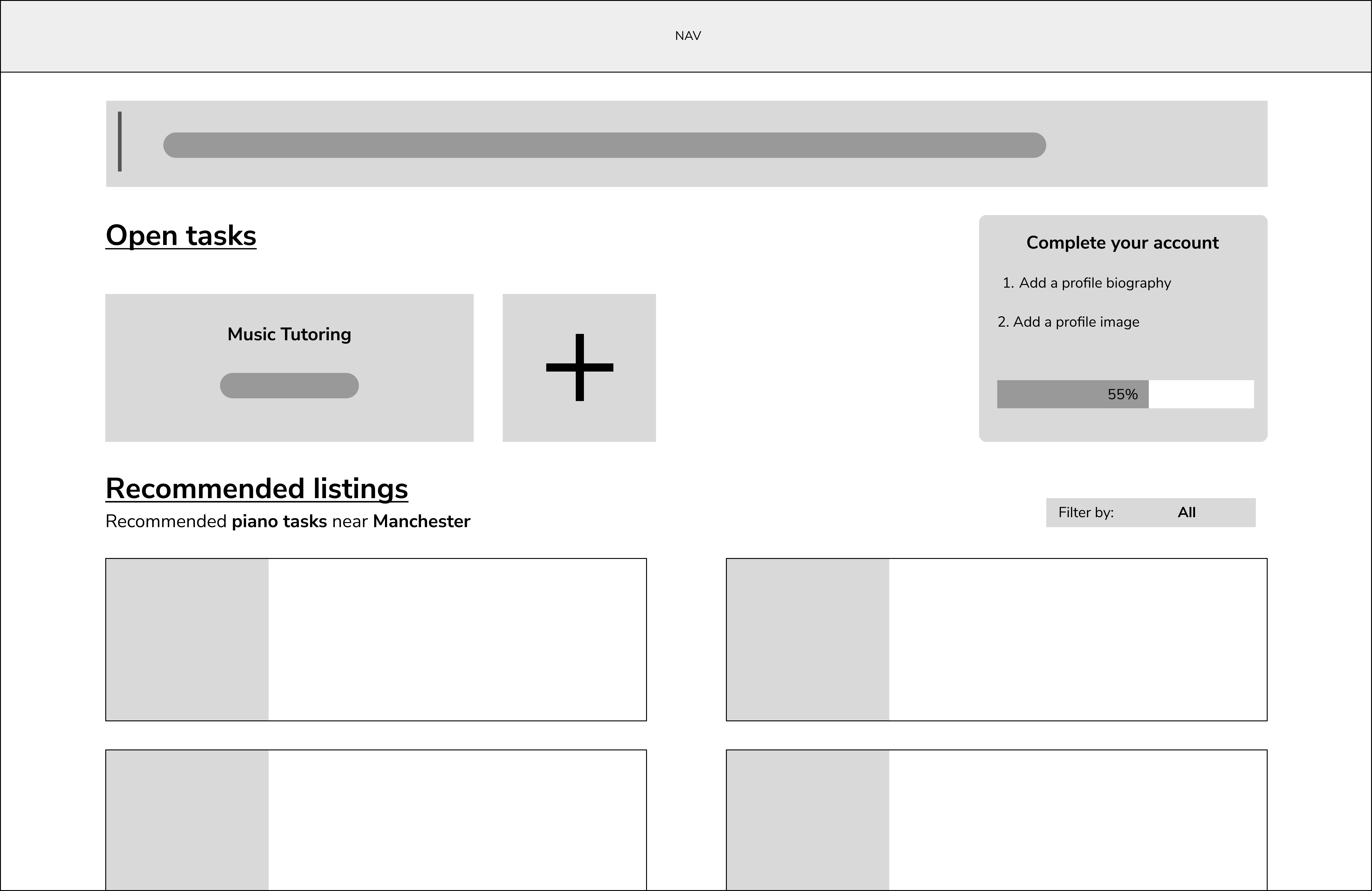
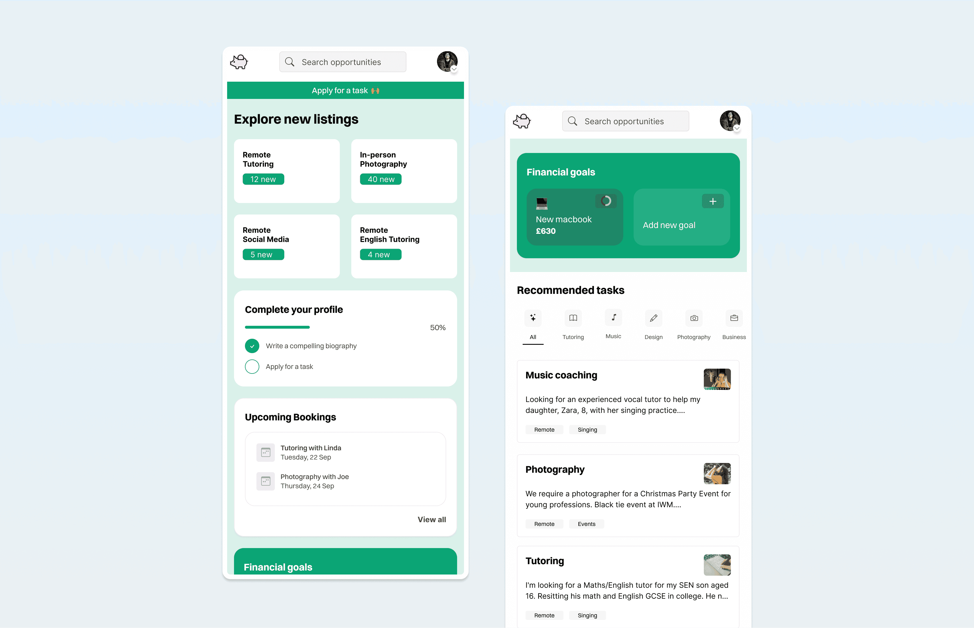
I explored multiple layouts for the dashboard. Frequent discussions with the team and feedback from potential users helped us discover the optimal layout. We rejected these designs for a multitude of reasons including poor visual hierarchy and a lack of focus on key requirements.

Final Designs

Having gone through this process I worked with developers to implement these designs. I worked closely with them to QA the implementation quality and provide feedback on spacing, legibility and how closely this matched with the intended design.

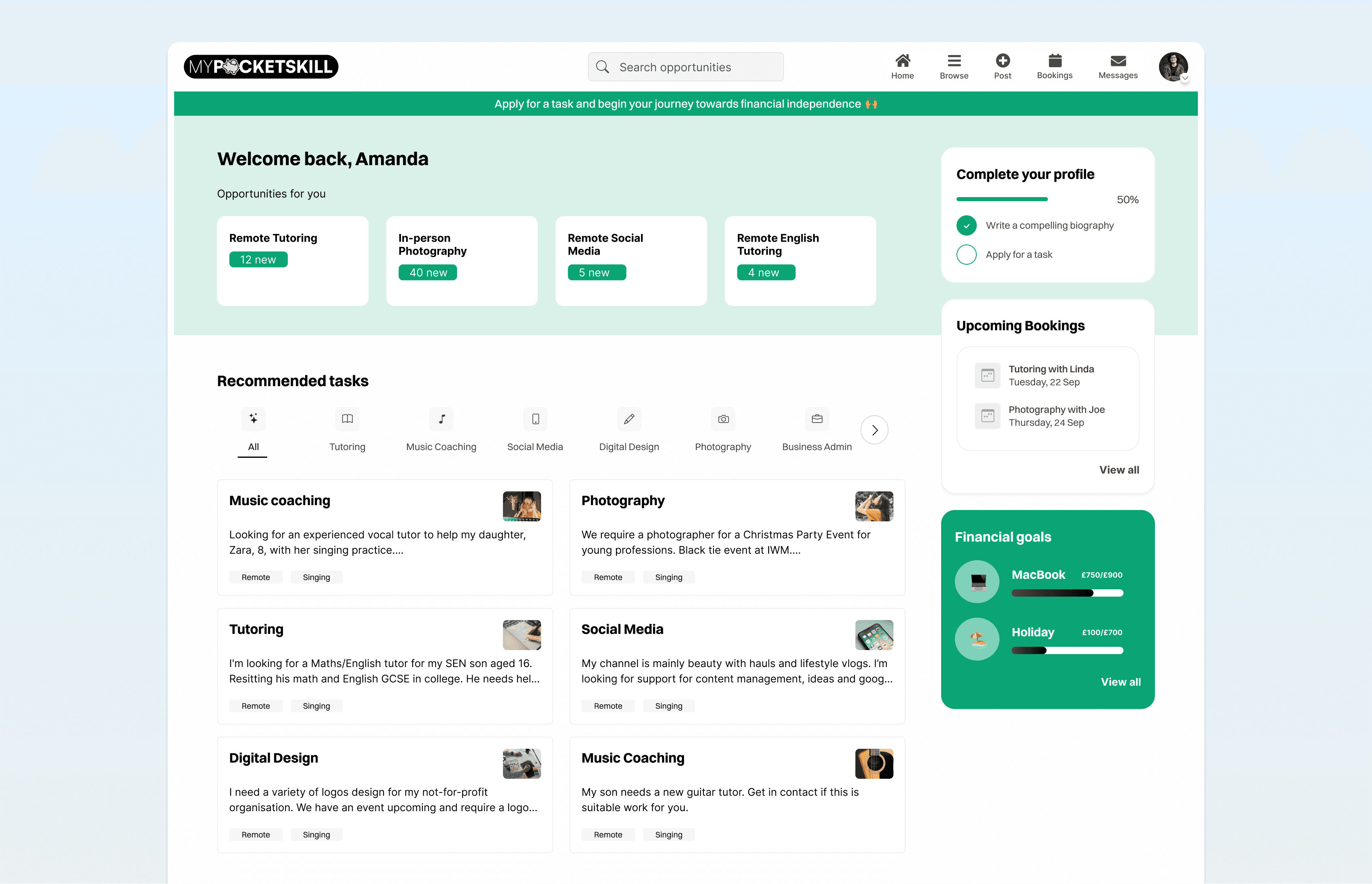
A smarter dashboard which better addresses user needs

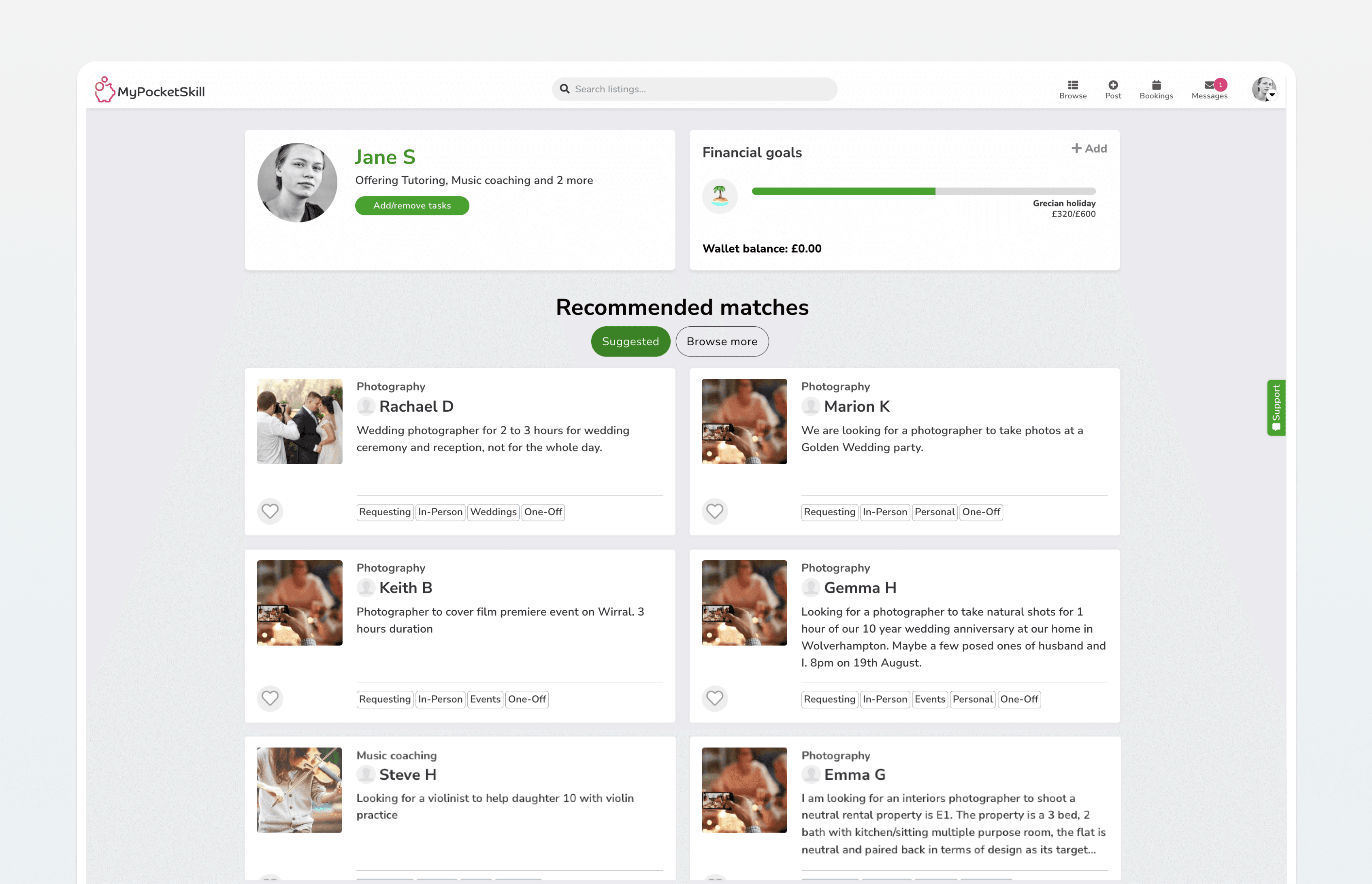
The new dashboard featured a more engaging design that better matched our updated brand language.

Old Dashboard - With old brand style
New Dashboard - With updated brand style

Inching closer to our intended brand language

We had recently updated our branding shortly before this dashboard redesign. This redesign was also an important step towards creating a coherent and consistent experience on the site that users would enjoy.

Inching closer to our intended brand language

We had recently updated our branding shortly before this dashboard redesign. This redesign was also an important step towards creating a coherent and consistent experience on the site that users would enjoy.

Impact

This redesign directly resulted in improved activation of newly signed up users as well as increased engagement from our existing users.

Impact

This redesign directly resulted in improved activation of newly signed up users as well as increased engagement from our existing users.

+23%

user activation*

+12%

time spent on platform

+13%

applications by freelancers

*user activation defined as completion of key tasks such as attending onboarding call, applying for jobs and others